Goal
Today, the skincare market is focused on selling the promise of eternal youth. The challenge, therefore, was to create a brand and its visual identity for a new, gender-neutral skincare brand. We’re not here to fight aging; we don’t want to look eternally young. The goal is to shift the skincare industry by creating a brand that embraces the passage of time and gives our skin what it needs to live fully today.
Created with Jory Rey - Supervised by Rebeka Arce
Duration: 1 week
Concept
Our skin’s needs aren’t so different from our basic needs: to be hydrated, nourished, and supplied with essential vitamins and minerals.
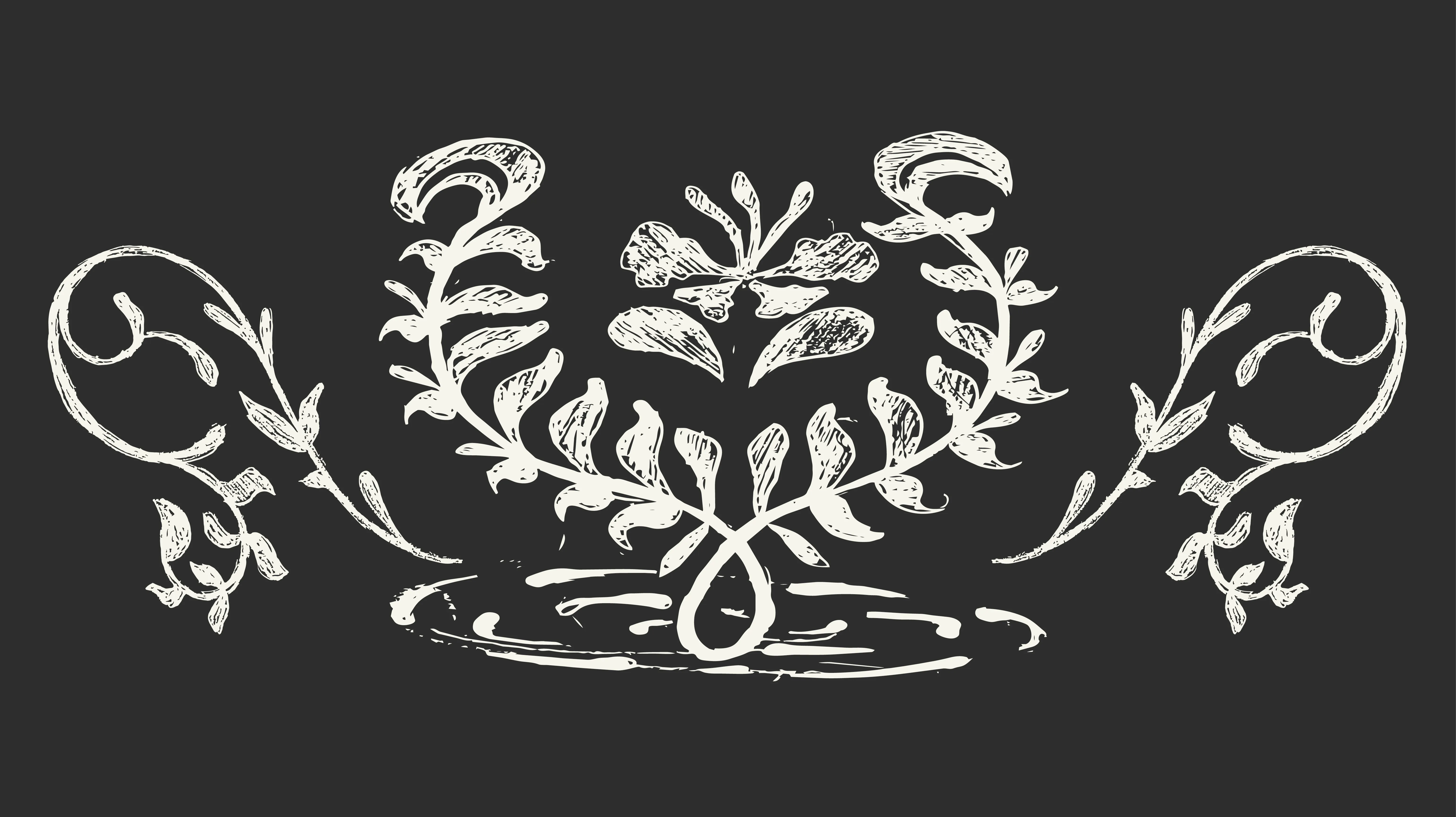
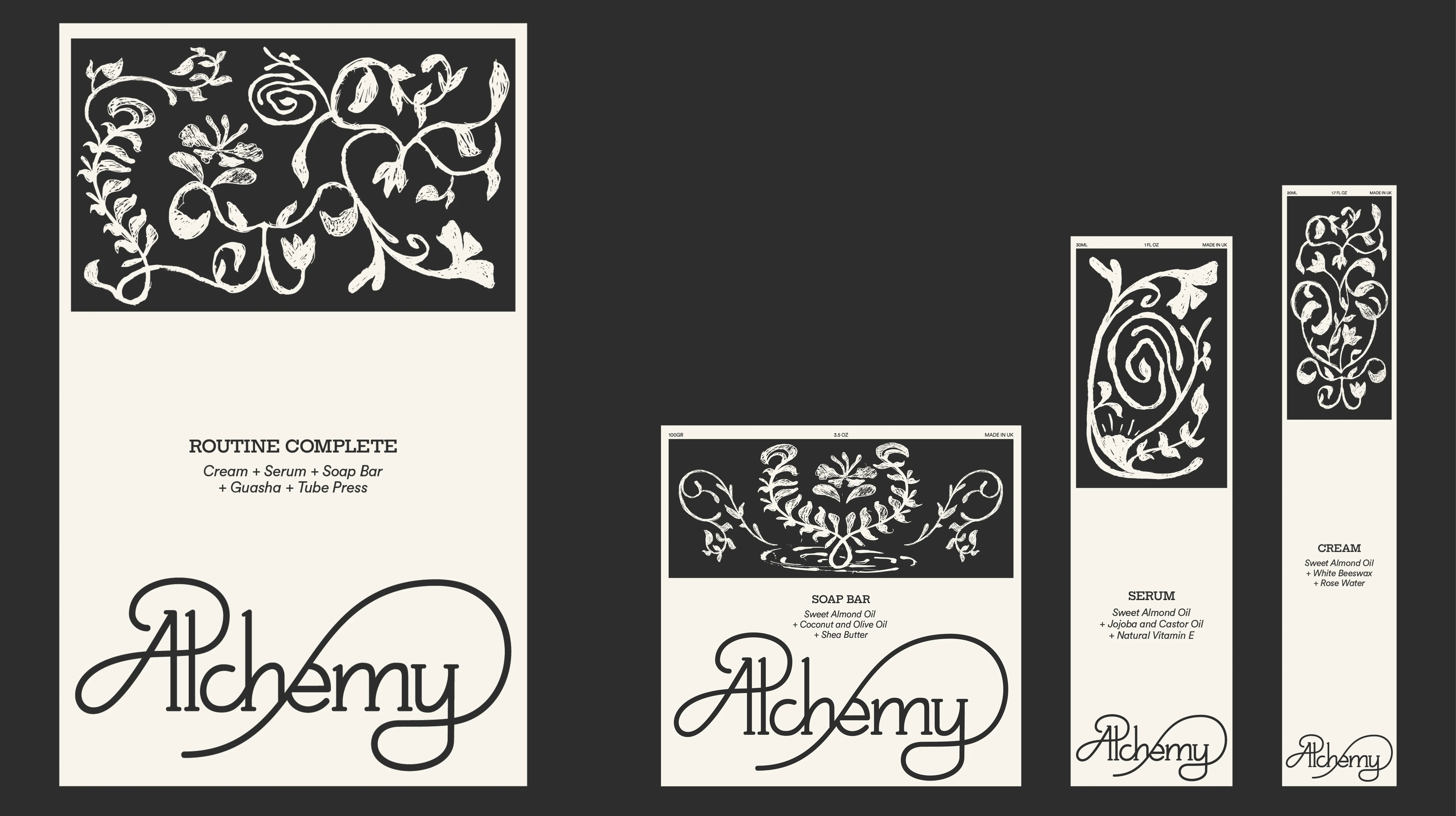
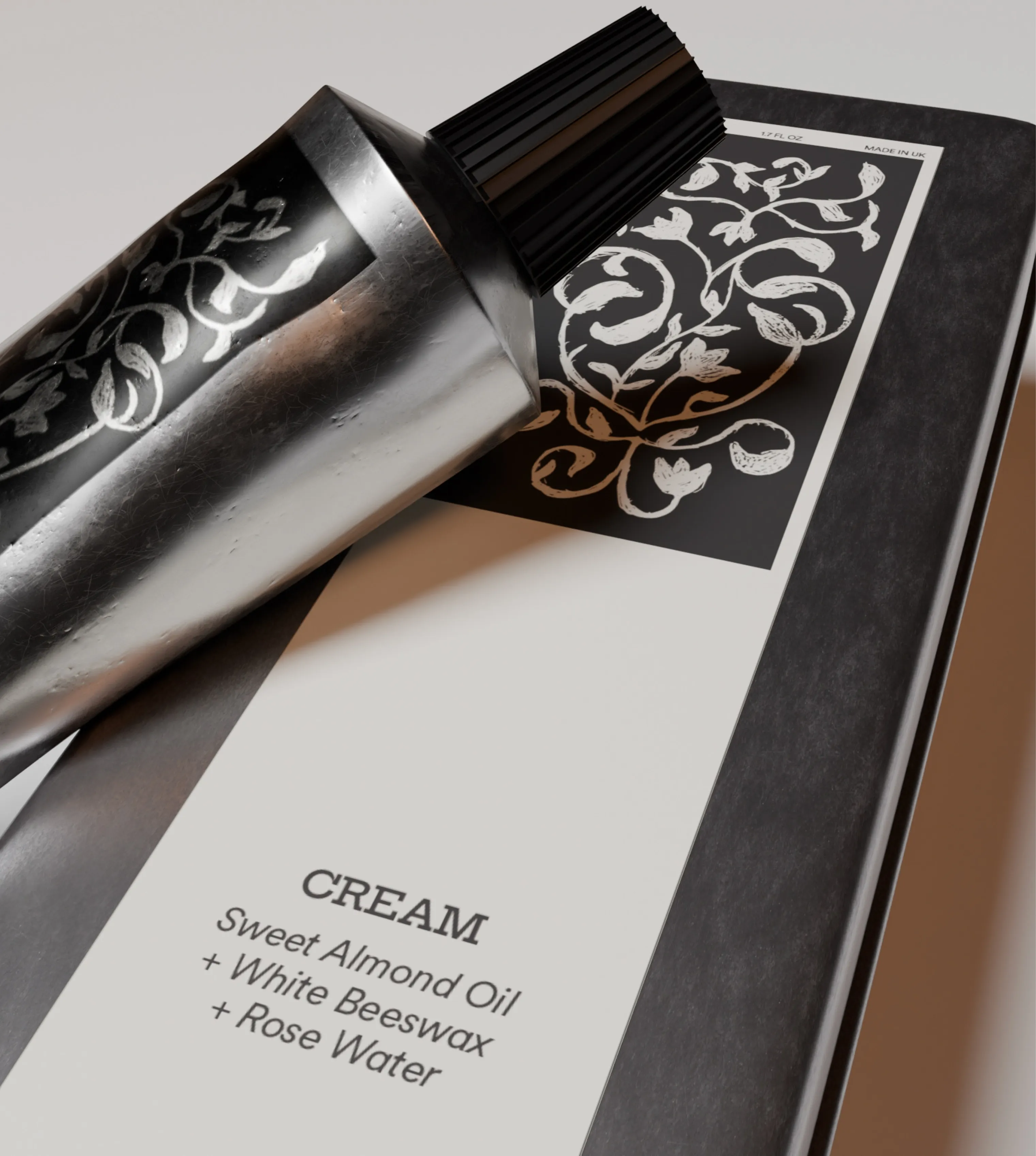
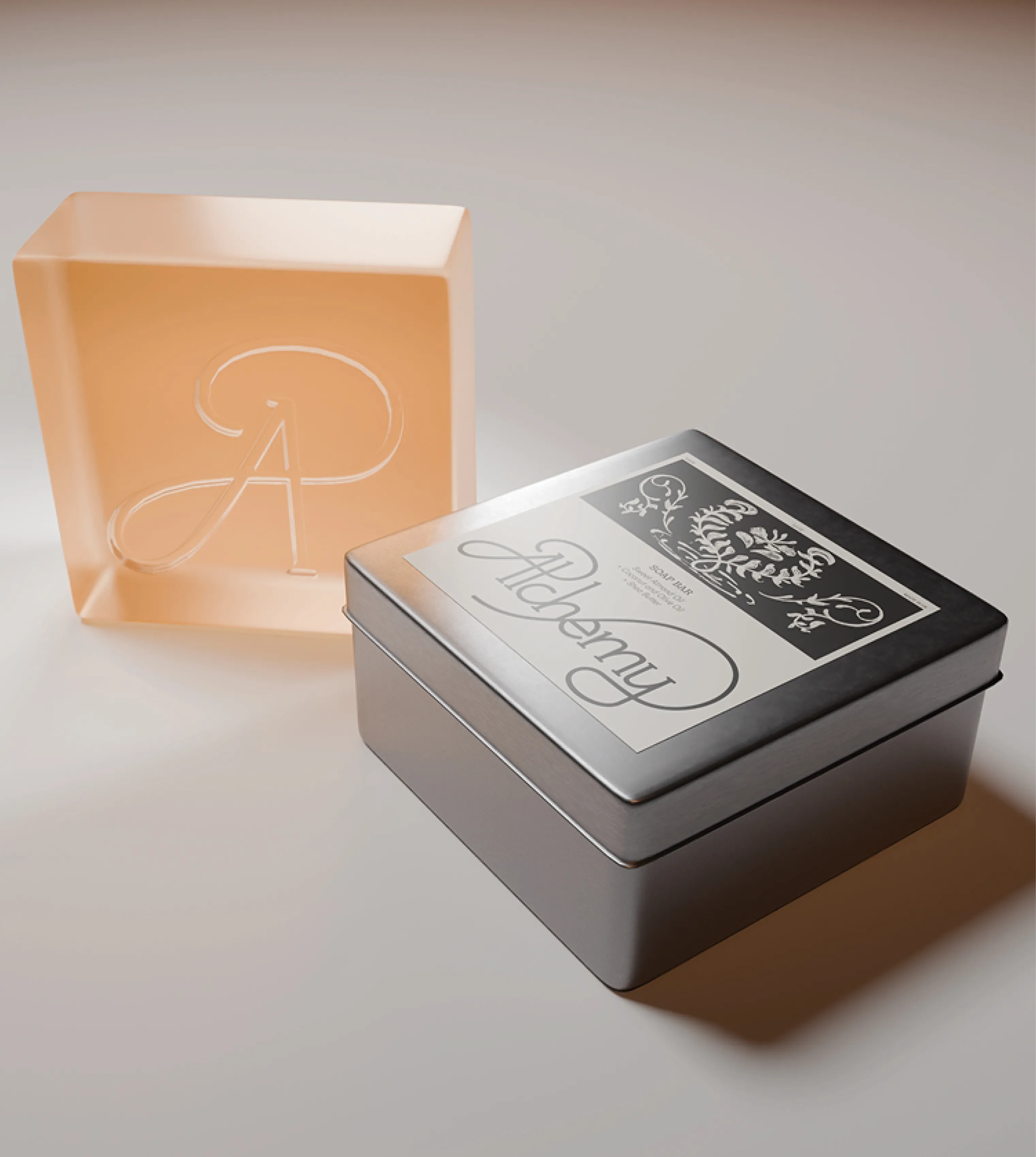
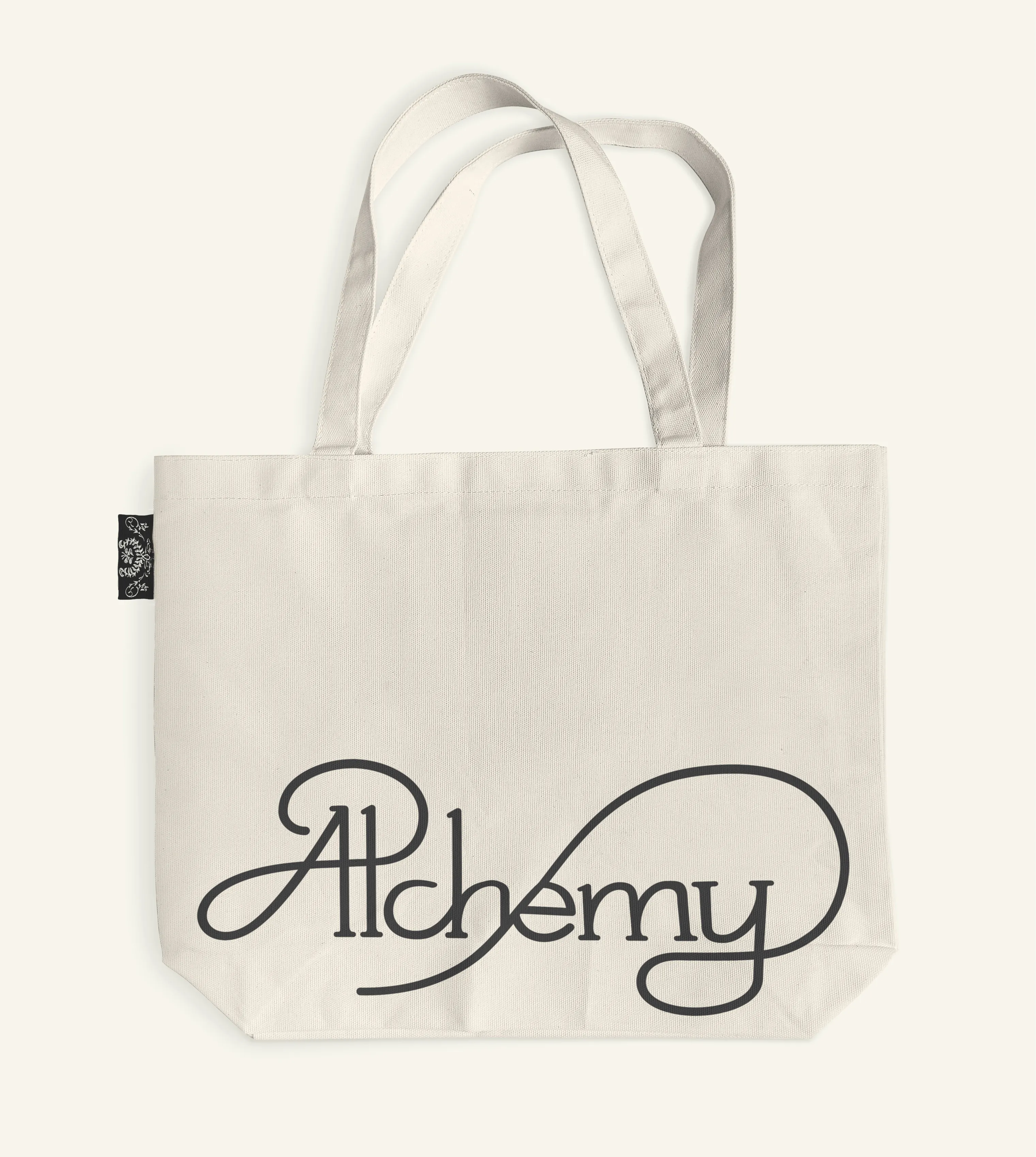
That’s why we chose to create Alchemy: a brand that believes ancient wisdom unites the body, mind, and soul. We wanted to create products based on natural ingredients used since the 20th century, which bring a holistic dimension to our daily lives. To convey the brand’s vision, we designed floral and ornamental illustrations. Each illustration corresponds to a product. They are integrated into minimalist packaging with the natural ingredients listed below, to avoid clutter and make this information easily accessible.
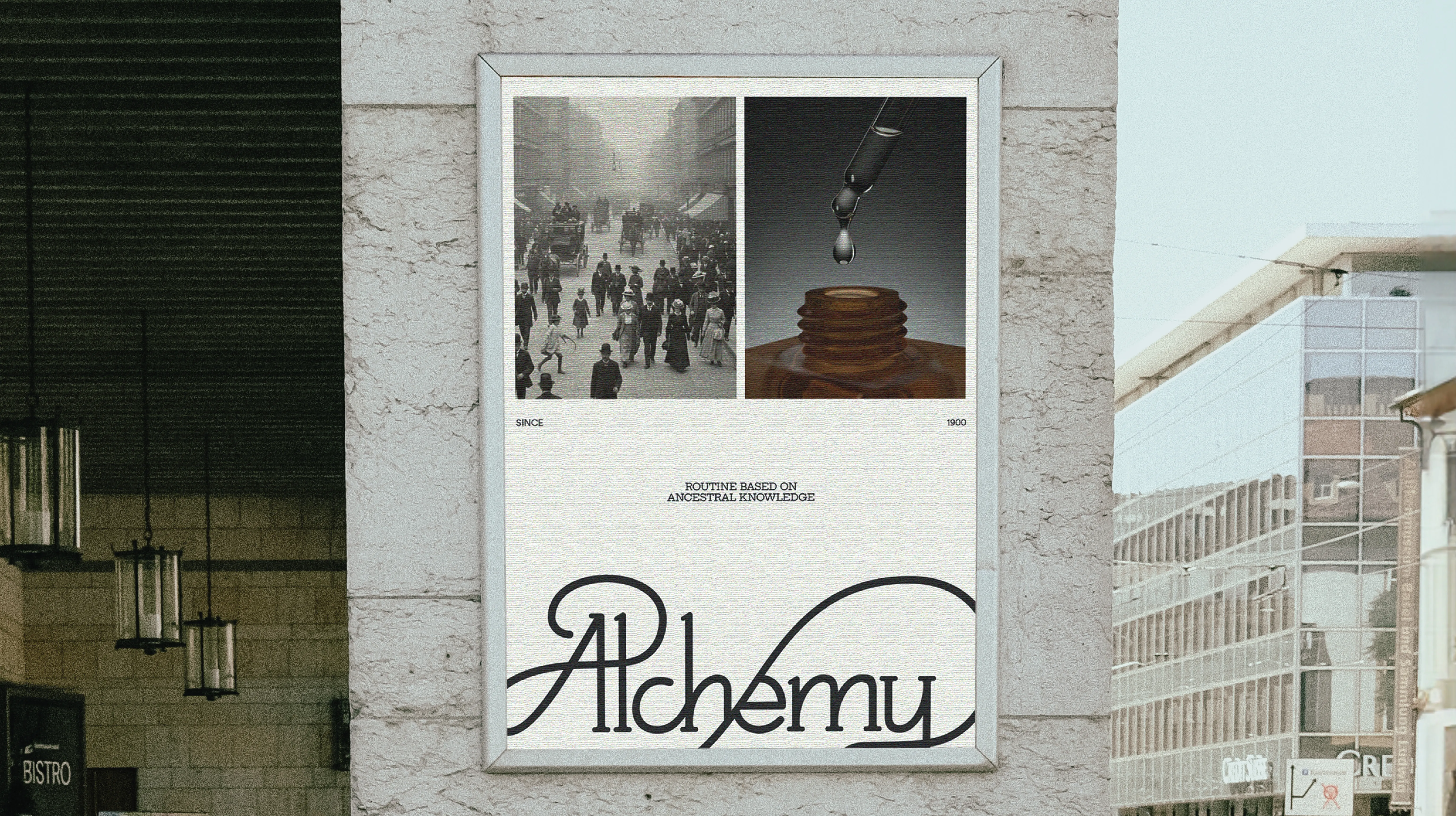
To complement our cosmetics, we’ve added a gouache palette and a tube squeezer that align with the brand’s history. A modular poster campaign completes the identity. The idea here was to juxtapose the visuals of our products with photos from the 20th century.
Soft skill
Pair work - Storytelling - Time management
Hard skill
After Effects - Illustration - Indesign
Fun fact
This week gave me the opportunity to discover a different approach to work and thinking, thanks to Rebeka. And since illustration isn’t our strong suit, creating these illustrations was also a truly rewarding challenge.