Goal
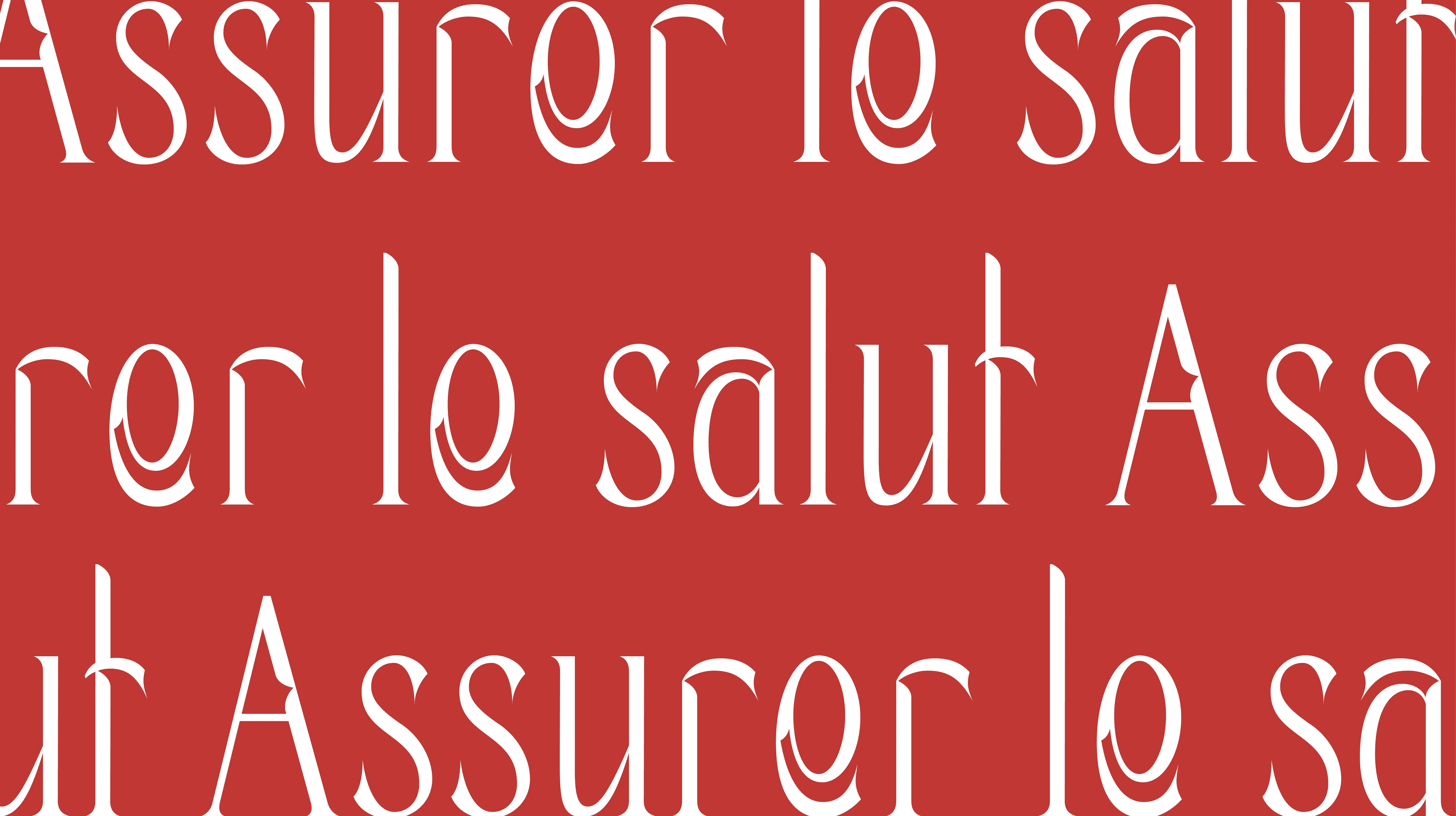
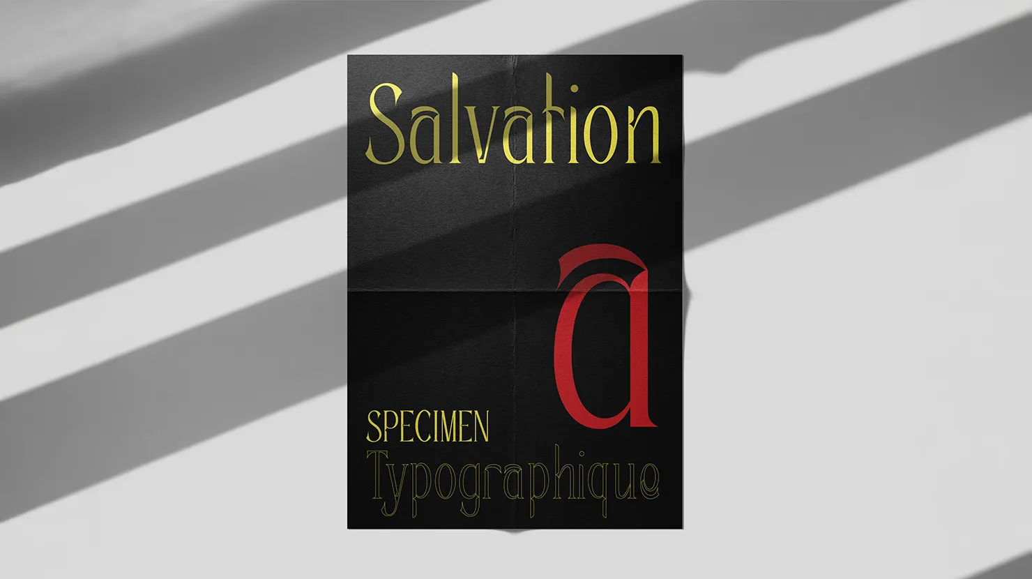
The challenge this week was to create a typeface based on a randomly selected word. I drew the word “salvation,” which evokes the idea of redemption and purification. The exact definition of the word is: the act of being saved, of escaping oblivion, ruin, or death. I used this definition as a guide to create my letters.
Supervised by Valerio Monopoli
Duration: 1 week
Concept
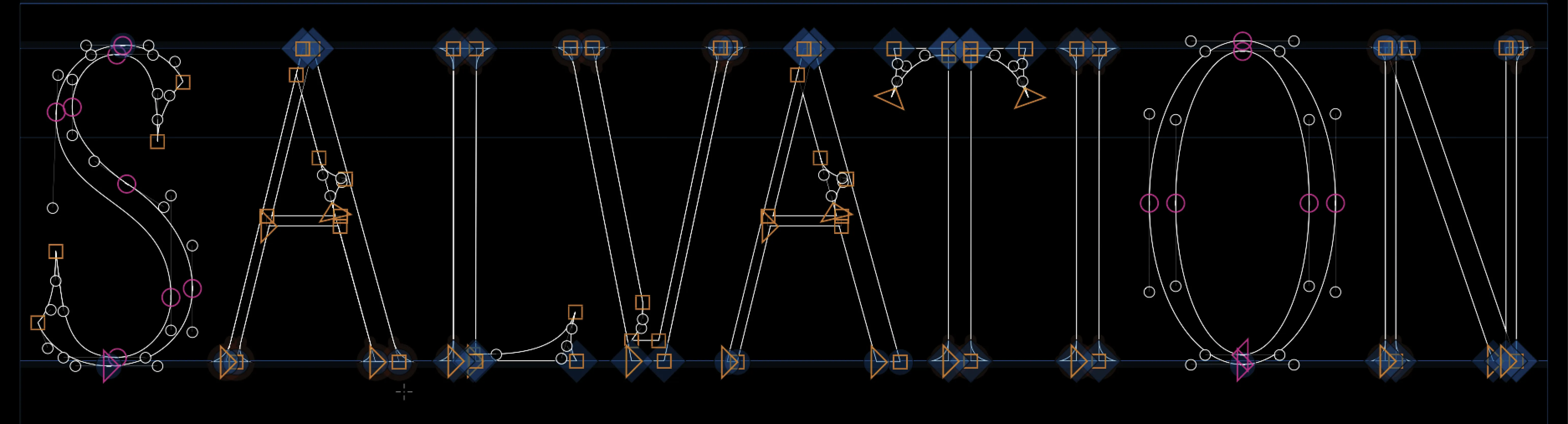
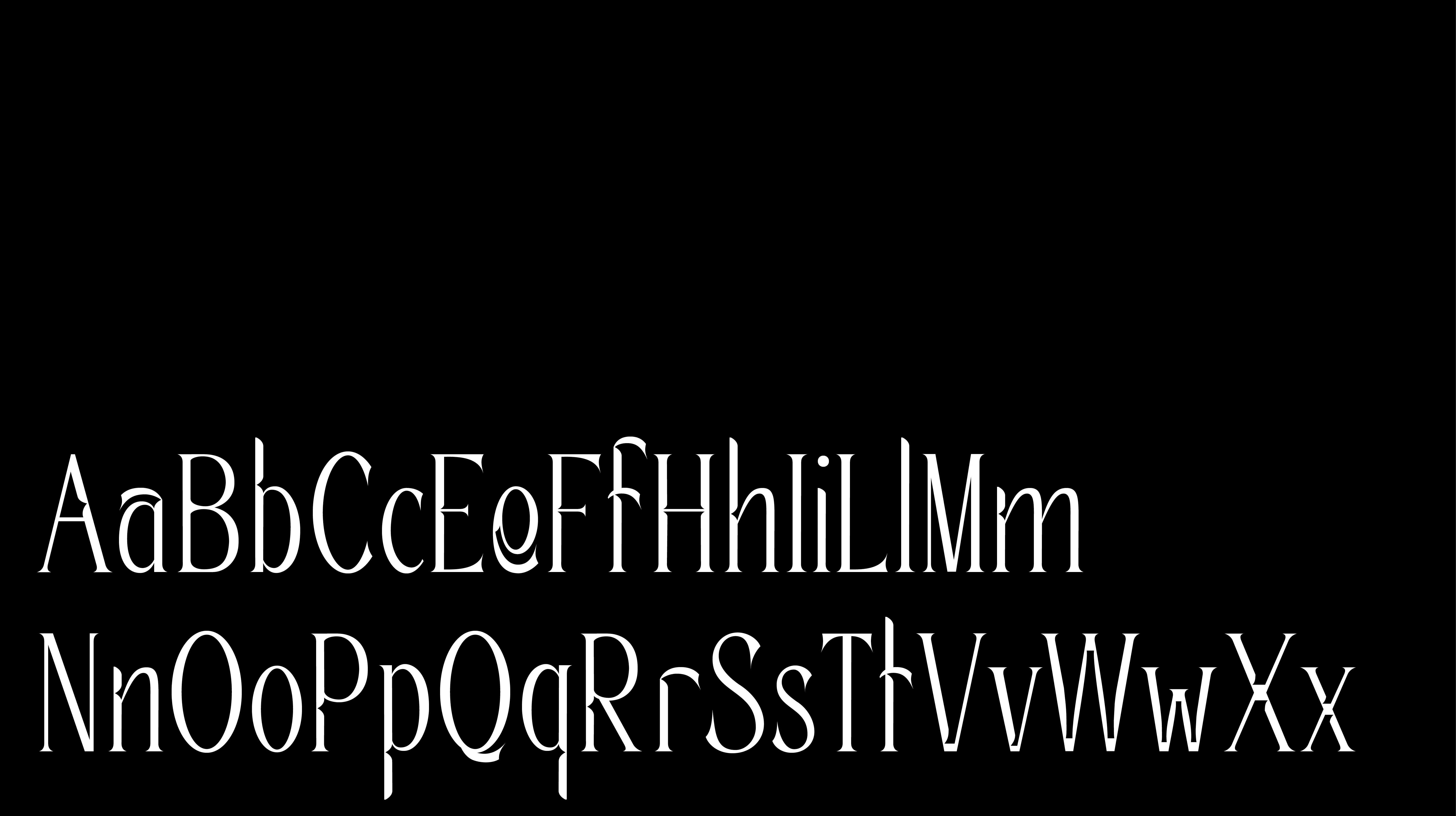
Historically, ink traps are used to absorb excess ink to ensure legibility and sharpness of the typeface. In my project, they become a symbolic element: they represent the areas that capture imperfections, excesses, or “errors.” I also saw a connection to a scythe, as a reference to death. So I started by drawing the lowercase r and a. You can see in the lowercase r an inspiration from a scythe. The ink traps thus came naturally into my typefaces.
Soft skill
Precision - Patience - Observation - Adaptability - Diligence
Hard skill
Typographic Anatomy - Letter Spacing - Glyphs
Fun fact
This typeface is the second one I created during my studies, and it really helped me learn more about Glyphs from a technical standpoint.